REBRAND
Adobe Photoshop, Adobe Illustrator
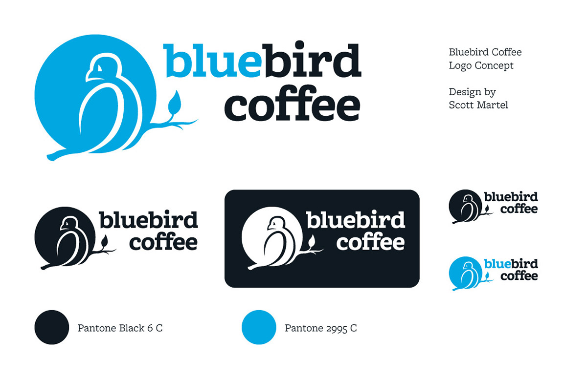
The goal of this project was to improve upon the logo and brand of an existing local business. I wanted to create a simple, recognizable logo that contained subtle imagery for people to discover for themselves.
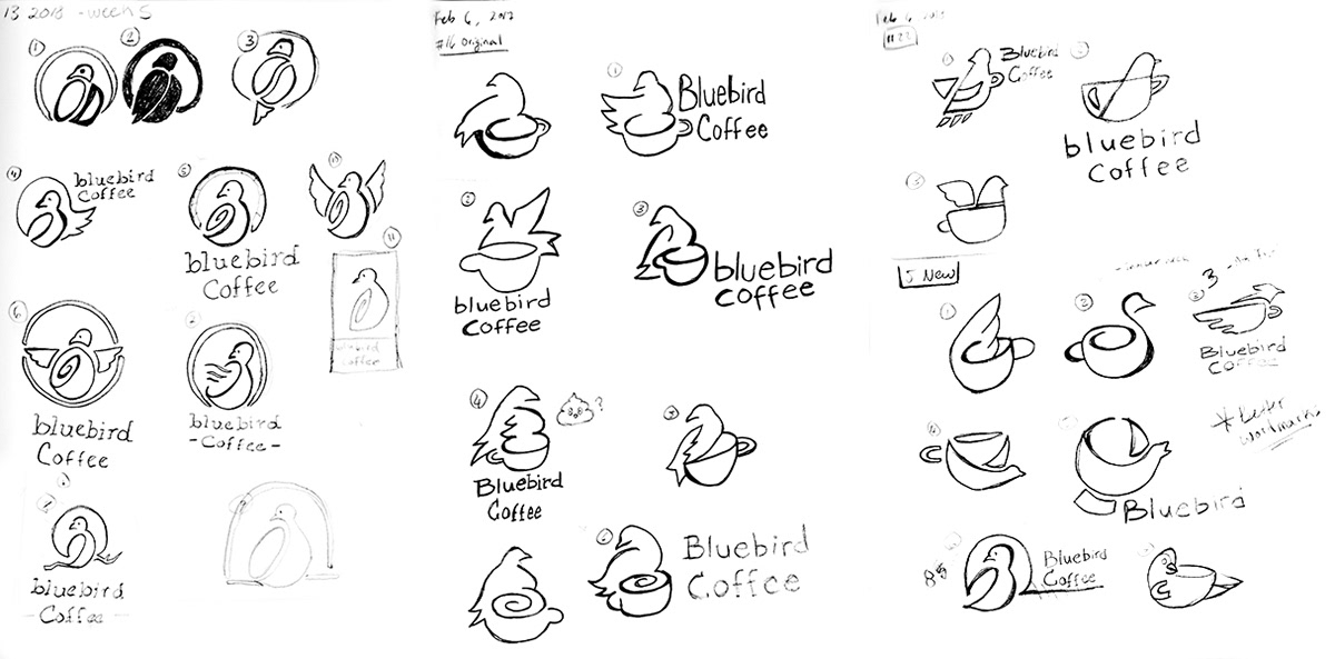
This multi-week process involved researching the business, its competitors, target audience, producing and presenting a sales pitch, etc. Through many sketches, iterations, and meetings with classmates and the art director, the direction for the logo was solidified, and digital production began. Afterwards, a visual identity for the brand was created, with a fresh and modern identity compared to the current branding.
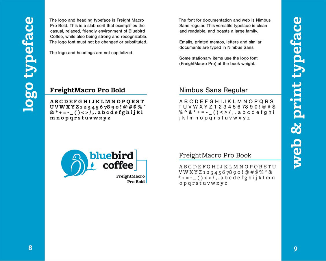
After the visual identity was complete, I put together a printed brand guideline to outline how the logo should be used, and how the brand should be presented in great detail.
I believe the new logo brings a more modern and unique identity to the company. The look and feel is fresh and airy, and maintains the theme of the original brand. It is not reminiscent of the larger, more corporate cafes which was an important factor to consider. It is important for local small businesses to stand apart and be able to hold their own.
This project is not an official rebrand.
